I am constantly being inspired by fashion, so here's my first "Fashionable" mood board/colour pallete made today.
I'm naming it "Earthen" and I'm sure it will be the first of many.
I love everything about it. The warm woody tones against the sky blue - some pops of orange, red and even a little lime green and yellow.
I named the blue "Painterly Blue" because that's what it seems to me - less aqua tones than sky-blue, a little bit watercolour-ish, and the same colour as the house I was born in. I remember helping repaint it when I was about 10 :)
I hope this board inspires you too!
Amy
Clockwise from top left:
Layered wooden wall via Design Sponge via Pinterest
Photo by masochistmimes.tumblr.com via Pinterest
Colour list my own
Photo by Christian Schuller via Pinterest
Saturday, June 18, 2011
Thursday, June 16, 2011
Quick DIY Art
Here's a little art project I did today - it's so easy that anyone can do it, and it really brightens up the wall.
It all began because I wanted a collection of light and bright pieces to hang together, and the picture on the front of this birthday card was way too funky to throw out.
Oh and because I was procrastinating. Just a little.

These are the bits I had lying around, including the 2 bold craft fabrics from Spotlight and card photo (called "Party Girl" by Urban Graphic).
I did some experimenting with different backings:
I liked the punch from the colours, but the frames weren't quite right, especially against the wall I was hoping to hang it on (probably a dark navy one). Plus I wanted a clean, fresh look. So the black one got painted white.
Be aware that plain white paint can look almost grey sometimes - I warmed this up a tiny bit with some "grey yellow acrylic toner"
I just laid all my bits and pieces out on the table and experimented, till I came up with something that held my attention. A little bit quirky and unusual. Who says you can't mix colours and patterns?

![]()
It all began because I wanted a collection of light and bright pieces to hang together, and the picture on the front of this birthday card was way too funky to throw out.
Oh and because I was procrastinating. Just a little.

These are the bits I had lying around, including the 2 bold craft fabrics from Spotlight and card photo (called "Party Girl" by Urban Graphic).
I did some experimenting with different backings:
I liked the punch from the colours, but the frames weren't quite right, especially against the wall I was hoping to hang it on (probably a dark navy one). Plus I wanted a clean, fresh look. So the black one got painted white.
Be aware that plain white paint can look almost grey sometimes - I warmed this up a tiny bit with some "grey yellow acrylic toner"
Then, played around with the newly painted frame and some different backings. The 2 on the right are craft papers from Spotlight:
I liked them, but not enough. The photo called for something a little more artsy.
I just laid all my bits and pieces out on the table and experimented, till I came up with something that held my attention. A little bit quirky and unusual. Who says you can't mix colours and patterns?Then got to work:
It was all too easy. You can do this with any picture or photo you have lying around, or rip a page from a book with a cool print. Or do your own little doodle with paint, ink, or sketch something with pencil.
My collection has begun and it's very me - in fact I might use this in my new banner.

Labels:
colourful wall art,
DIY art,
easy artwork
Sunday, June 12, 2011
Master Bedroom mood board
I've spent the last few hours mocking up a concept for my parent's bedroom.
The situation:
The bedroom has dark navy walls all over, and my parent's don't have either time or energy to repaint. (Plus, it was painted by the...[taste-questionable] previous house owners and trust me, the colour of this bedroom is the least of their worries!). So I needed a quick fix that works with the navy.
The room now:
Here's a little picture of the room (in a messy state sorry) to give you an idea of the kind of navy we are talking about:
My "client's" aesthetic:
I know my mum appreciates bright colours and patterns. I believe she was told, many many many years ago, that her colour choices were "like a native" whatever that means! I think both her and I take that as a compliment - and I would call her aesthetic "bohemian" and "eclectic", with a touch of "traditional".
(Which, obviously, is not portrayed in the existing bland bedroom, but like I said, no time, and other bigger priorities. Seriously, when does my mother ever get time to hang out in the bedroom? I'm pretty sure she only stumbles into bed in the dark each night, and is up before the sun in the morning!).
My Dad was raised in South America for a time, and he appreciates the Bright & Vivid's too.
Solution:
I began with a quick mood board. The fabrics basically inspired the entire look. The navy is actually a "Warm" navy, surprisingly, so I wanted warm colours that were still bright.
1. All these fabrics were found on http://www.fabric.com/
2. The turquoise of this vase ($5.67 from The Warehouse) is a definite "mum" colour and gives a modern touch and some soft shaping.
3. Bedside tables from Early Settler. They have been talking about getting new ones for eons and this pair is just their style.
4. An Orange Velvet Pouf from Urban Outfitters compliments the blue and the fabrics. Now if I could just find something similar in NZ!
Just for fun, I mocked up some "wall views" that are laughably amateur, but great for getting an idea of the outcome!
Now I just need to find out what she thinks of all this! I know it's very bold, but hey, this is my family we're talking about.
Any feedback is more than welcome!
Thanks for stopping by.
The situation:
The bedroom has dark navy walls all over, and my parent's don't have either time or energy to repaint. (Plus, it was painted by the...[taste-questionable] previous house owners and trust me, the colour of this bedroom is the least of their worries!). So I needed a quick fix that works with the navy.
The room now:
Here's a little picture of the room (in a messy state sorry) to give you an idea of the kind of navy we are talking about:
| The back wall |
| The opposite wall, with doors to ensuite and landing |
My "client's" aesthetic:
I know my mum appreciates bright colours and patterns. I believe she was told, many many many years ago, that her colour choices were "like a native" whatever that means! I think both her and I take that as a compliment - and I would call her aesthetic "bohemian" and "eclectic", with a touch of "traditional".
(Which, obviously, is not portrayed in the existing bland bedroom, but like I said, no time, and other bigger priorities. Seriously, when does my mother ever get time to hang out in the bedroom? I'm pretty sure she only stumbles into bed in the dark each night, and is up before the sun in the morning!).
My Dad was raised in South America for a time, and he appreciates the Bright & Vivid's too.
Solution:
I began with a quick mood board. The fabrics basically inspired the entire look. The navy is actually a "Warm" navy, surprisingly, so I wanted warm colours that were still bright.
1. All these fabrics were found on http://www.fabric.com/
2. The turquoise of this vase ($5.67 from The Warehouse) is a definite "mum" colour and gives a modern touch and some soft shaping.
3. Bedside tables from Early Settler. They have been talking about getting new ones for eons and this pair is just their style.
4. An Orange Velvet Pouf from Urban Outfitters compliments the blue and the fabrics. Now if I could just find something similar in NZ!
Just for fun, I mocked up some "wall views" that are laughably amateur, but great for getting an idea of the outcome!
![]() |
| Bedspread and pillows inspired by fabric, existing lamps and new bedside tables |
![]() |
| The other wall with some colourful pictures and the bubble vase with flowers |
Now I just need to find out what she thinks of all this! I know it's very bold, but hey, this is my family we're talking about.
Any feedback is more than welcome!
Thanks for stopping by.
Labels:
green decor inspiration,
interiors,
navy bedroom
Thursday, June 9, 2011
Green for Haters! (a green inspiration post)
If, like me, you like the colour green but don't love using it in your decor, this post may inspire you to change your mind.
I used to get a little bored with green - sweet green... soft green... calm and serene and oh so...70s green?
Until I found the following inspiration that I'm about to share - a series of images showing the use of green in a way that doesn't overwhelm. And keeps colour-junkies like me happy.
See my green tutorial here for a how-to with using green.
Yes, it's definitely green, but the texture and strong black pattern in the tapestry make it a soft backdrop rather than an overkill of Kermity-ness.
POP. I am double down with this. One little injection of bright finger-paint-green into an artsy setting makes all the difference. The paper cranes in the tree get me every time.
Just for fun - a quick cakey interruption - because I am stunned, s-t-u-n-n-e-d I tell you, that the "asparagus" are not real asparagus, but actually rolls of fondant. Um, amazing! And isn't that a lovely green? Sweetapolita is my idol.
All it took was a green lamp-stand, cushion, and a leafy plant to brighten this room up.
I just love this painting of birds - it may be mass produced in China but it's oh-so-bright and fills me with memories of being in Brazil, with all the colourful hammocks, rainforest, and Brazilian gemstones! I would love to have it framed over a sofa with a green cushion.
Speaking of which, this cushion from Etsy is perfectly green, but with the added interest of reds and yellows and fun pictures - cute.
And while we're on accesories... is that ring lovely or what?
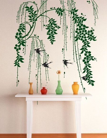
Another way to mix green into your scheme - a wall decal is removeable and makes a boring space interesting, pronto.
I hope you are feeling a little inspired - for the how-to see this post: A Green Tutorial.
:)
I used to get a little bored with green - sweet green... soft green... calm and serene and oh so...70s green?
Until I found the following inspiration that I'm about to share - a series of images showing the use of green in a way that doesn't overwhelm. And keeps colour-junkies like me happy.
See my green tutorial here for a how-to with using green.
![]() |
| from |
| via |
![]() |
| via |
All it took was a green lamp-stand, cushion, and a leafy plant to brighten this room up.
![]() |
| via |
![]() |
| via |
![]() |
| via |
![]() |
| via |
I hope you are feeling a little inspired - for the how-to see this post: A Green Tutorial.
:)
Wednesday, June 8, 2011
A Swedish How-To
The whole beauty of the Scandinavian aesthetic is its simplicity. Which is why I thought I'd put together these rules and create a quick moodboard with a few of the simplest ideas to Swedify your place and maybe get the look of some of the Scandinavian homes I showed yesterday.
The end result? Awesome. I would love to be do this to my place.

So simple, and so effective.
Sources below.
:)
Simple picture frame via
Modern yellow chair via
Patterned fabric via via
Stationary holders via
Floral & geometric cushion via via
Red Dala cushion via
Round yellow rug via
The end result? Awesome. I would love to be do this to my place.

So simple, and so effective.
Sources below.
:)
Simple picture frame via
Modern yellow chair via
Patterned fabric via via
Stationary holders via
Floral & geometric cushion via via
Red Dala cushion via
Round yellow rug via
From Sweden with Love
I've always had a thing for bright, clean colours on a white background. So it was no wonder that when I went to study in Sweden back in 2007, I was in awe of pretty much everything I saw.
The houses appeared old to me (compared to New Zealand houses) and bland on the outside - but colourful havens of cosiness on the inside.
I personally love the idea of using Scandinavian colour schemes and fusing them with some warm tones and classic forms - like thick carpet rugs and beautiful New Zealand native wood. The whole concept of "Eclectic" sits perfectly with me. It embraces fusion and experimentation. Who says you have to stick to one boring style?
Here are a few inspiration shots.
I couldn't resist - the yellow Elk sticker on the wall above those shelves bring back some memories. I remember being scared when driving along the motorway in Sweden, that an Elk would run onto the road. A Swede once told us "Between the Elk and the car, the Elk always wins".
I don't know how true that was but I had heard they could be 6 feet tall, and in my mind Elks were a sort of modern day dinosaur. Especially coming from NZ where the most wild animal we have is a Possum, a lizard, a bird, or maybe a wild pig.
Both the images above are from an IKEA site - IKEA being another heart-throbbing love of my life that we don't have in New Zealand. (I did manage to snaffle a few purchases back home with me in my suitcase tho! In fact, I kind of had to post 4 extra boxes of stuff that wouldn't fit in the suitcase.)
The red chair with cute cushion brings in some personality.
Classic Scandinavian colours and patterns with a whole heap of art brightening the wall. Imagine how inspired and creative you would feel to work at that desk.
(Almost) last but not least... a Dala horse! The traditional Swedish horse from Dalarna. One day, a red Dala horse will be a common fixture around my house. I haven't figured out where I would put it yet - maybe use one as a door-stop?
Speaking of horses.... here is something to ponder:
A horse lamp!
Yep, a full size black horse with a lamp sprouting from its head.
I personally find it a teeny tiny little bit TERRIFYING. Just saying. But whatever rocks your boat, and it's got to start some good conversations...
The houses appeared old to me (compared to New Zealand houses) and bland on the outside - but colourful havens of cosiness on the inside.
I personally love the idea of using Scandinavian colour schemes and fusing them with some warm tones and classic forms - like thick carpet rugs and beautiful New Zealand native wood. The whole concept of "Eclectic" sits perfectly with me. It embraces fusion and experimentation. Who says you have to stick to one boring style?
Here are a few inspiration shots.
This kids room packs a punch - the bright white walls are warmed up by the wood floor and wild colours.
I couldn't resist - the yellow Elk sticker on the wall above those shelves bring back some memories. I remember being scared when driving along the motorway in Sweden, that an Elk would run onto the road. A Swede once told us "Between the Elk and the car, the Elk always wins".
I don't know how true that was but I had heard they could be 6 feet tall, and in my mind Elks were a sort of modern day dinosaur. Especially coming from NZ where the most wild animal we have is a Possum, a lizard, a bird, or maybe a wild pig.
![]() |
| via |
![]() |
| via |
I kind of love this colourscheme - it's so simple but still interesting. There are no heavy colours in the room - only light, bright ones, and the different level lampshades keep it casual and artistic.
| via |
| via |
Ok, ok, I know this is supposed to be a kid's bedroom, but if it weren't for the alphabet, I would definitely consider making it MY bedroom. Maybe I could use the letters to spell something else, because the colours in them are so awesome!
| via |
![]() |
| via |
Speaking of horses.... here is something to ponder:
![]() |
| via |
Yep, a full size black horse with a lamp sprouting from its head.
I personally find it a teeny tiny little bit TERRIFYING. Just saying. But whatever rocks your boat, and it's got to start some good conversations...
Labels:
horse lamp,
IKEA,
scandinavian style,
Swedish design
Tuesday, June 7, 2011
Ye Olde Vintage Chic
Vintage is all go these days, from handbags to sofas it seems we just can't get enough of those classic old designs.
These teacups make me want to have a tea party - and the rose would be edible, of course!
What about this vintage bird wallet from New Zealand shop IkoIko:
And I love this vintage card by New Zealand artist Rochelle Andrews:
Check out some of her beaut paintings here.
This sewing workshop is uber cute.
The pink wallpaper below is just so... pretty. Like icing on a cake. mmm
Big rustic-looking leather armchairs like the one below can cost a bomb, but I saw 2 matching chairs almost identical on the weekend when I was browsing second-hand shops with my boyfriend. They were about NZ$300 each and because they were old they had that lived-in look naturally.
I could have tied myself to the chairs and refused to leave until they were mine but aside from being a poor student, I also have nowhere to keep such beautiful friendly-looking specimens...
I can just imagine them paired up with some funky colourful mismatched cushions, hardwood floors and a beautiful rug.... *big sigh*
One day, maybe! :)
These teacups make me want to have a tea party - and the rose would be edible, of course!
![]() |
| via |
What about this vintage bird wallet from New Zealand shop IkoIko:
And I love this vintage card by New Zealand artist Rochelle Andrews:
![]() |
| via |
This sewing workshop is uber cute.
| via |
The pink wallpaper below is just so... pretty. Like icing on a cake. mmm
And I'm loving the mix of old and new in the following picture - the chair is a modern design but uses a traditional-yet-funky pattern.
| via Houzz |
The books, floral arrangement and distressed-look cabinet compliment the bright-but-mellow paintings here:
| via |
Big rustic-looking leather armchairs like the one below can cost a bomb, but I saw 2 matching chairs almost identical on the weekend when I was browsing second-hand shops with my boyfriend. They were about NZ$300 each and because they were old they had that lived-in look naturally.
I could have tied myself to the chairs and refused to leave until they were mine but aside from being a poor student, I also have nowhere to keep such beautiful friendly-looking specimens...
![]() |
| via |
One day, maybe! :)
Labels:
art,
leather armchair,
vintage,
vintage decor
Subscribe to:
Posts (Atom)