If, like me, you like the colour green but don't love using it in your decor, this post may inspire you to change your mind.
I used to get a little bored with green - sweet green... soft green... calm and serene and oh so...70s green?
Until I found the following inspiration that I'm about to share - a series of images showing the use of green in a way that doesn't overwhelm. And keeps colour-junkies like me happy.
See my green tutorial
here for a how-to with using green.
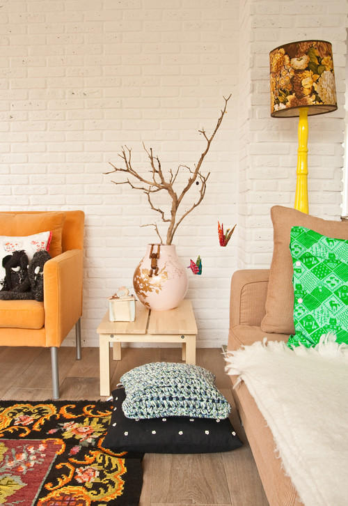
Yes, it's definitely green, but the texture and strong black pattern in the tapestry make it a soft backdrop rather than an overkill of Kermity-ness.
POP. I am double down with this. One little injection of bright finger-paint-green into an artsy setting makes all the difference. The paper cranes in the tree get me every time.
Just for fun - a quick cakey interruption - because I am stunned, s-t-u-n-n-e-d I tell you, that the "asparagus" are not real asparagus, but actually rolls of fondant. Um, amazing! And isn't that a lovely green? Sweetapolita is my idol.
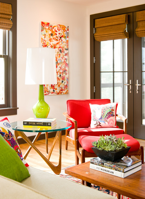
All it took was a green lamp-stand, cushion, and a leafy plant to brighten this room up.
I just love this painting of birds - it may be mass produced in China but it's oh-so-bright and fills me with memories of being in Brazil, with all the colourful hammocks, rainforest, and Brazilian gemstones! I would love to have it framed over a sofa with a green cushion.
Speaking of which, this cushion from Etsy is perfectly green, but with the added interest of reds and yellows and fun pictures - cute.
And while we're on accesories... is that ring lovely or what?
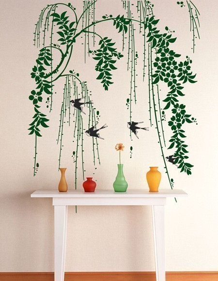
Another way to mix green into your scheme - a wall decal is removeable and makes a boring space interesting, pronto.
I hope you are feeling a little inspired - for the how-to see this post:
A Green Tutorial.
:)


No comments:
Post a Comment
Thank you for your comment!